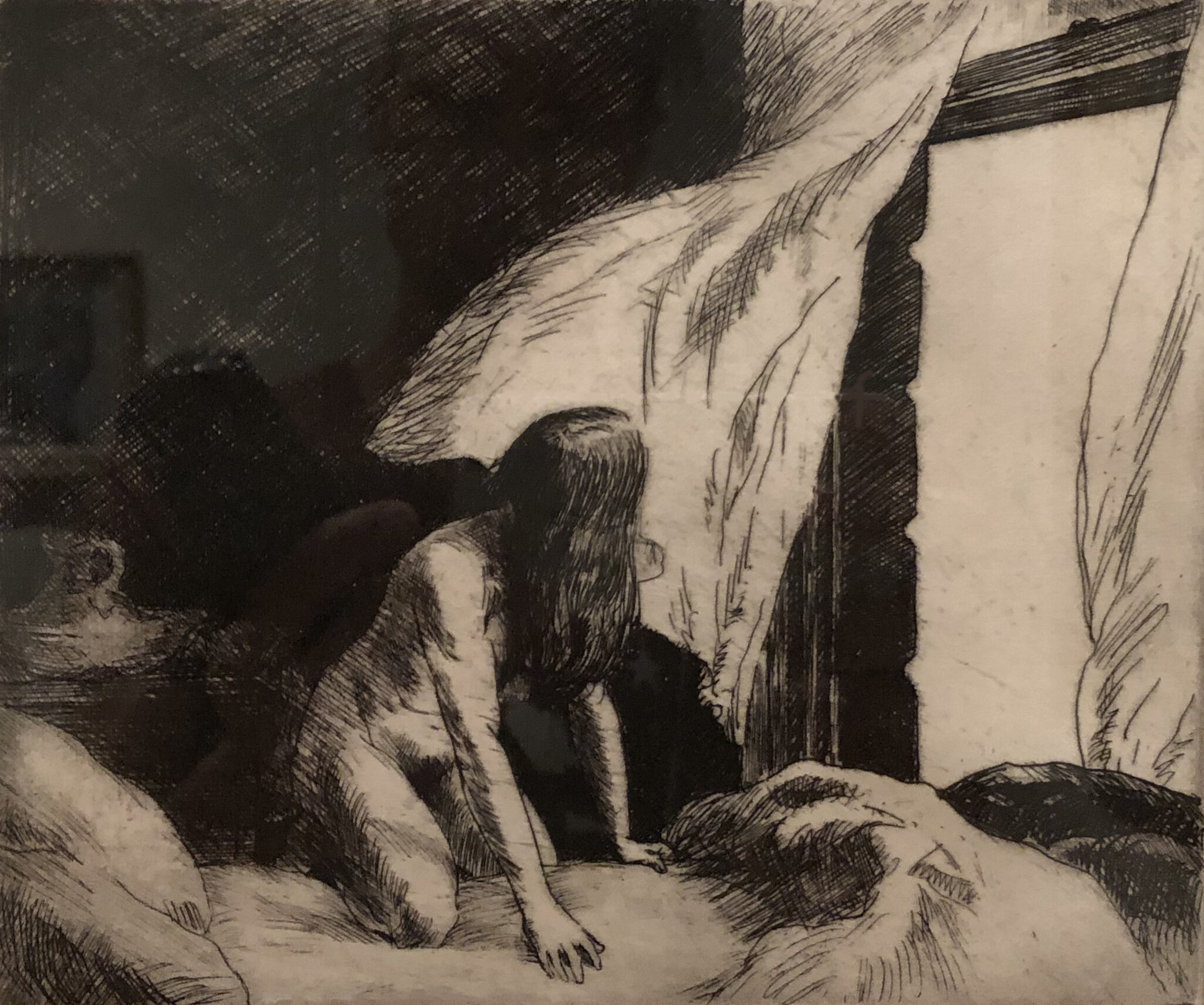
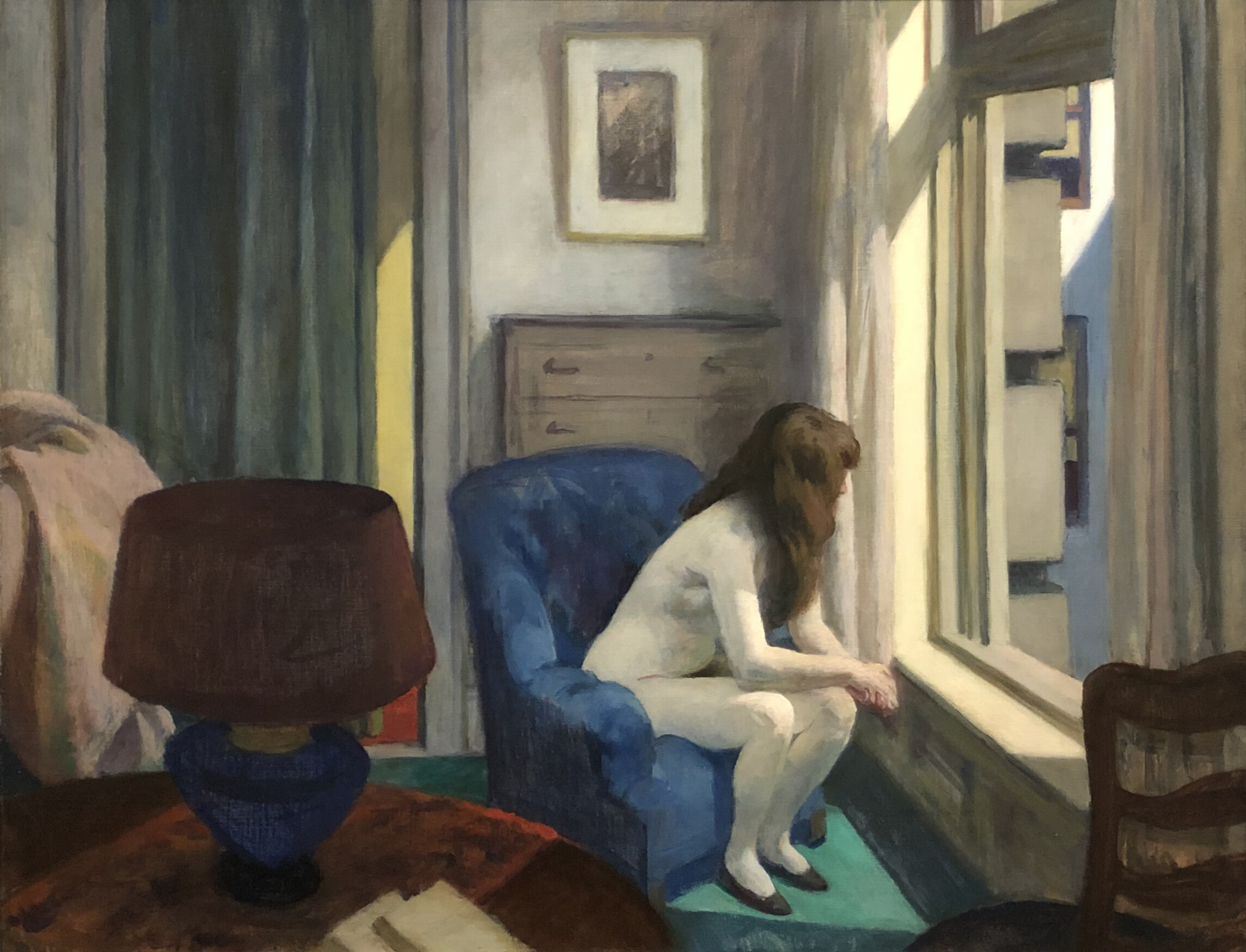
Edward Hopper and the American Hotel at the VMFA, October 22nd, 2019 - February 23rd 2020
In this article I talk about the current VMFA special exhibition. I go into a short formal and historical analysis of Hopper’s work, and then talk about why the current exhibition, while being very worth seeing, is structured in a way that is incongruous with the American painter’s work.
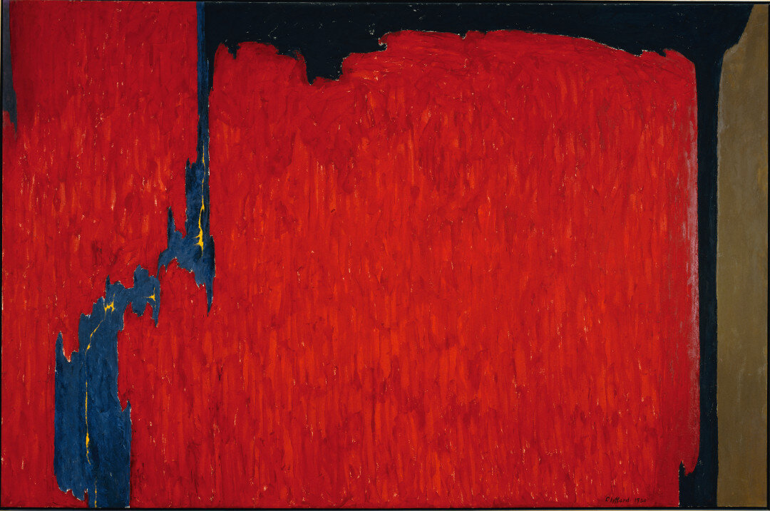
“Wyeth is about the pursuit of strangeness, but he is not whole, as Hopper is whole"
- Mark Rothko
Miles Hall
December 26th
On view at the Virginia Museum of Fine Arts until February 23rd is the strange but interesting exhibit: Edward Hopper and the American Hotel. Strange not only because of the strangeness of Hopper’s paintings, but also because of the unique structure of the exhibition: it’s a bit unlike anything I’ve ever seen from a museum show featuring a major artist.
As the title implies, this exhibit narrows the scope of its focus to the theme of the American Hotel. Hotels were certainly a major motif for the artist from the 1920’s onward, and the exhibition does a good job of connecting Hopper’s hotel paintings to his earlier magazine work. It also does a good job of relating the artist’s work to the emergence of the American Hotel as a modern phenomenon. But in terms of its structure and emphasis, the show constantly seems to stop well-short of any meaningful engagement with the significance of the work itself, indulging in various diversions and shenanigans along the way.
Artistically speaking, Edward Hopper was a late bloomer. He made his first real sale in 1927, at the age of 40. By the time he had begun to mature as a painter he was fast becoming a dinosaur, a throw-back to an older, more straight-forward kind of representational work, and by the 1950’s he was increasingly surrounded by a radically new and abstract art. Nevertheless – even in this quickly evolving world - he maintained his reputation as a relevant figure up to his death in 1967, influencing a whole variety of emerging artists who came after him.
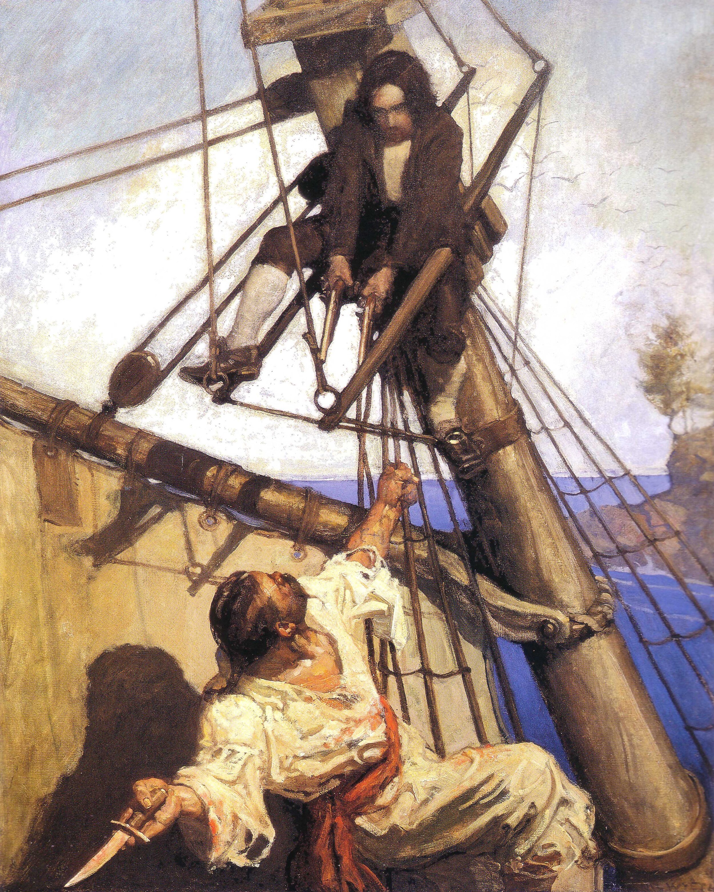
Hopper’s place in Art History defies classification on multiple levels. Perhaps seen as the most American of all 20th century painters, Hopper also staunchly evaded being labeled as part of the “American scene.” In this and many other ways he is a singular figure, an anachronism, inhabiting a territory all his own: not quite considered modern like the Abstract Expressionists, but somehow decidedly more modern than the Ashcan School, whose paintings seem very early 20th century compared to his. He never succumbed to the temptations of regionalism, (e.g. Grant, Benton, Dixon or Burchfield), and he separated himself as quickly as he could from corporate illustration and the influence of painters like Pile, Remington or N. C. Wyeth (who is nearly his exact contemporary.)
So how did Hopper’s painting fall into this kind of no-man’s land? What makes him so American? And what makes him so Modern, despite his apparent traditionalism? These are all interesting questions to ask while taking in the current exhibit.
The show begins with a Self Portrait painted in 1903. Tonally solid with simple, well-constructed forms, this painting is brushy, blunt and fluid, with the artist placing himself solidly in front of a black background.
There are distinct parallels here to the the young Ashcan school, with the dark background and lively, direct strokes. Early on Hopper would show with the Ashcan painters, but later distanced himself from the spirit of their work: his cityscapes were painted, as he would later say, “with not a single incidental ashcan in sight.”
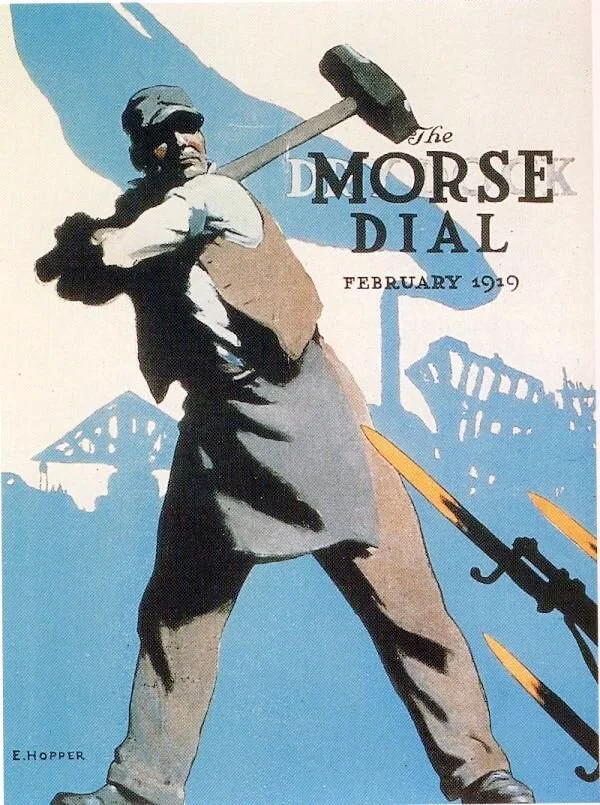
Directly across the room from this self-portrait are a series of magazine covers by Hopper, magazines like Hotel Management and Tavern Topics. These represent Hopper’s artistic alter ego: the commercial illustrator. In 1905 Hopper would go to work at an advertising agency, supporting himself from then until 1927, primarily through creating covers for trade magazines, two of them being Hotel Management and Tavern Topics.
While excelling at this type of work, Hopper despised it: “I was always interested in architecture but the editors always wanted people waving their arms.”
Before 1927 there are basically two distinct Hoppers: the painter and the illustrator. He hit the peak of his powers as an illustrator with Smash the Hun, a forceful, blunt, 1918 propaganda poster.
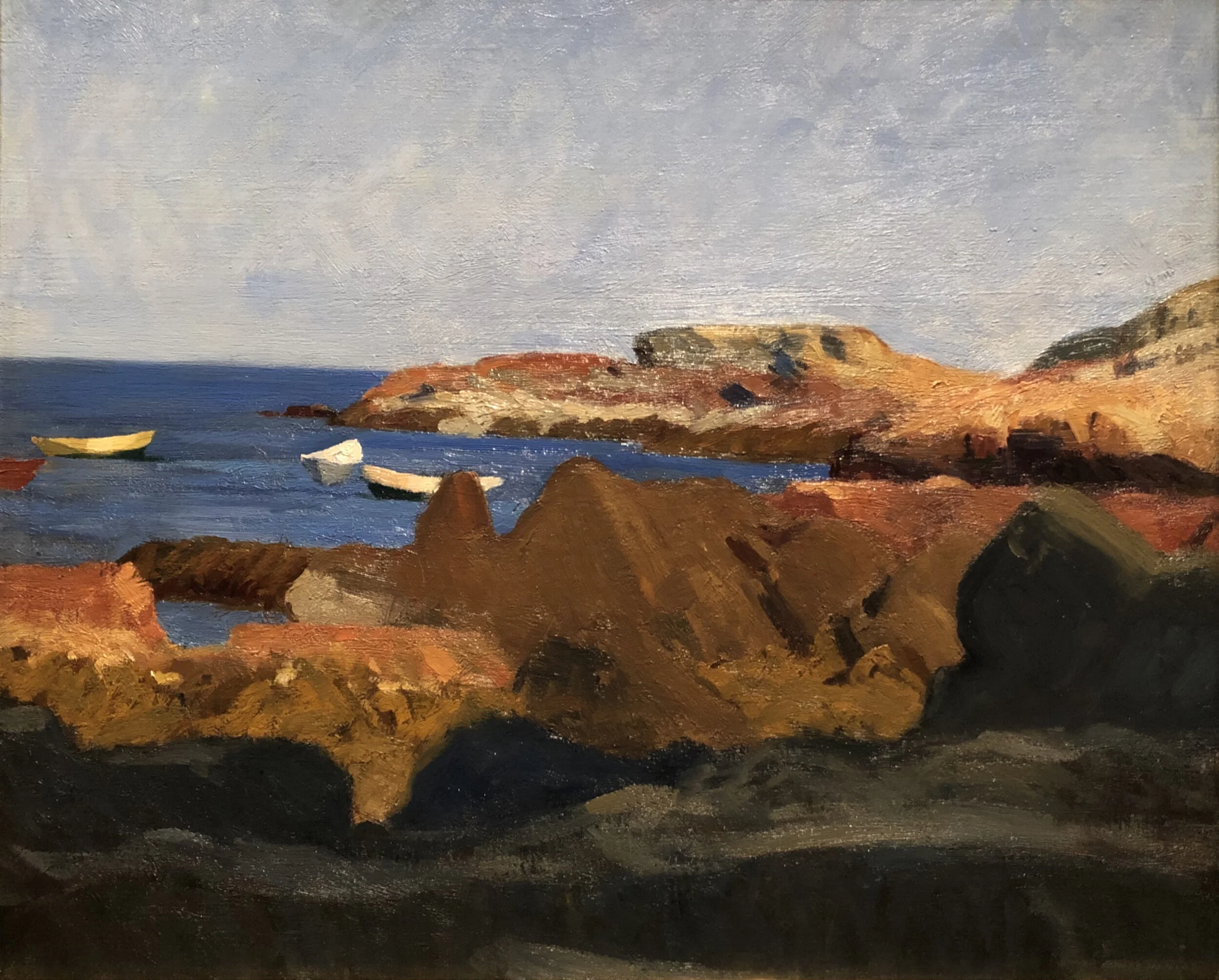
The apex of Hopper as a pure painter happens in the nineteen-teens and twenties with his landscapes. Possibly his best work in terms of light, atmosphere, color and paint are the Maine coastal pictures. This exhibition has two beautiful examples of these in the third room. The waves and rocks in these Maine paintings are just as muscular and bold as the sledge-hammer wielding ship-repairman in Smash the Hun, but more solid and corporeal in their surfaces than any flat, poster-style illustration could achieve.
Ultramarine blue and rust-orange color schemes convey the light of late afternoon under the kind of open skies only seascapes afford. Depth, light and solidity are achieved with an astounding economy of means but also with a surprisingly generous, thick surface when it comes to the paint. These are all about direct sense experience.
The two different Hoppers, painter and illustrator, traveled alongside each other simultaneously throughout the period of his development, living seemingly distinct artistic lives. But as he was able to get away from illustration and support himself completely via painting, something new emerges. The mature Hopper is a kind of third iteration of himself, something different from either the illustrator or pure painter. His paintings never again have quite the same luster of the sensate world that his work from the nineteen-teens did. It would be more arid and calculated as he plunged steadily into that artistic no-man’s-land I mentioned before, this territory that makes him so singularly American and cements his reputation as a true Modernist. Without this mature Hopper, we might think of him merely as the restrained odd-ball of the Ashcan school. However, as he was able to shed the constraints of his commercial career, something important from that career merged into his studio practice, certain qualities and ways of thinking that would change Hopper the painter permanently. We no longer see the artist choosing a motif merely for its visual characteristics. Rather we see him staging, constructing, and transforming his spaces while playing strange, quiet psychological games with the viewer. He seems to have stepped back from his subject in order to orchestrate the austere and ambitious requirements of his own personal, expressive ends.
It’s as though he became his own visionary art director.
As sales increased and he had freedom to travel and paint, the hotel became a central motif. No longer would he set up an easel on sight. Instead, he would make sketches and take notes – including color notes - and then synthesize them and paint back in his studio. Often he used his wife, Jo, as a model.
In Hotel Room from 1931 we have a brilliantly composed picture of a solitary woman sitting in bed, head bent down and reading a slip of paper in her lap. Hopper has designed this canvas with a series of overlapping forms, including strong verticals and horizontals. Everything has its place, every element plays its part in a balanced visual equation, and nothing is painted in more detail than is absolutely necessary. The figure is framed by all these elements in such a way that we are pushed all around the composition, but also so that our attention is inevitably brought back to the woman and her gaze. Like Vermeer, there is no story here, but a complete moment in itself.
Architecture plays a major role in this piece. It’s not just that the painter is using architectural elements, but that he’s constructing his compositions in an architectural way. This is a decidedly modernist tendency with parallels to movements like Constructivism, De Stijl and Bauhaus, as well as architectural styles prevalent in the US during this time, styles like the Chicago School or Art Deco. We see possible influences from the world of illustration as well. Whatever the case, Hopper is using the mundane elements of a hotel as material to construct his own pictorial structure. He is not fixated on these anecdotal elements. By focusing on the everyday and the mundane, there is still a kinship here to the Ashcan school, and yet the kind of composition he is creating, with it’s dynamic push-and-pull equilibrium, is something unparalleled among Henri’s other students. The Ashcan painters never achieved anything like the still, spare monumentality of this canvas.
In other rooms we encounter more figures in quiet, reflective moments.
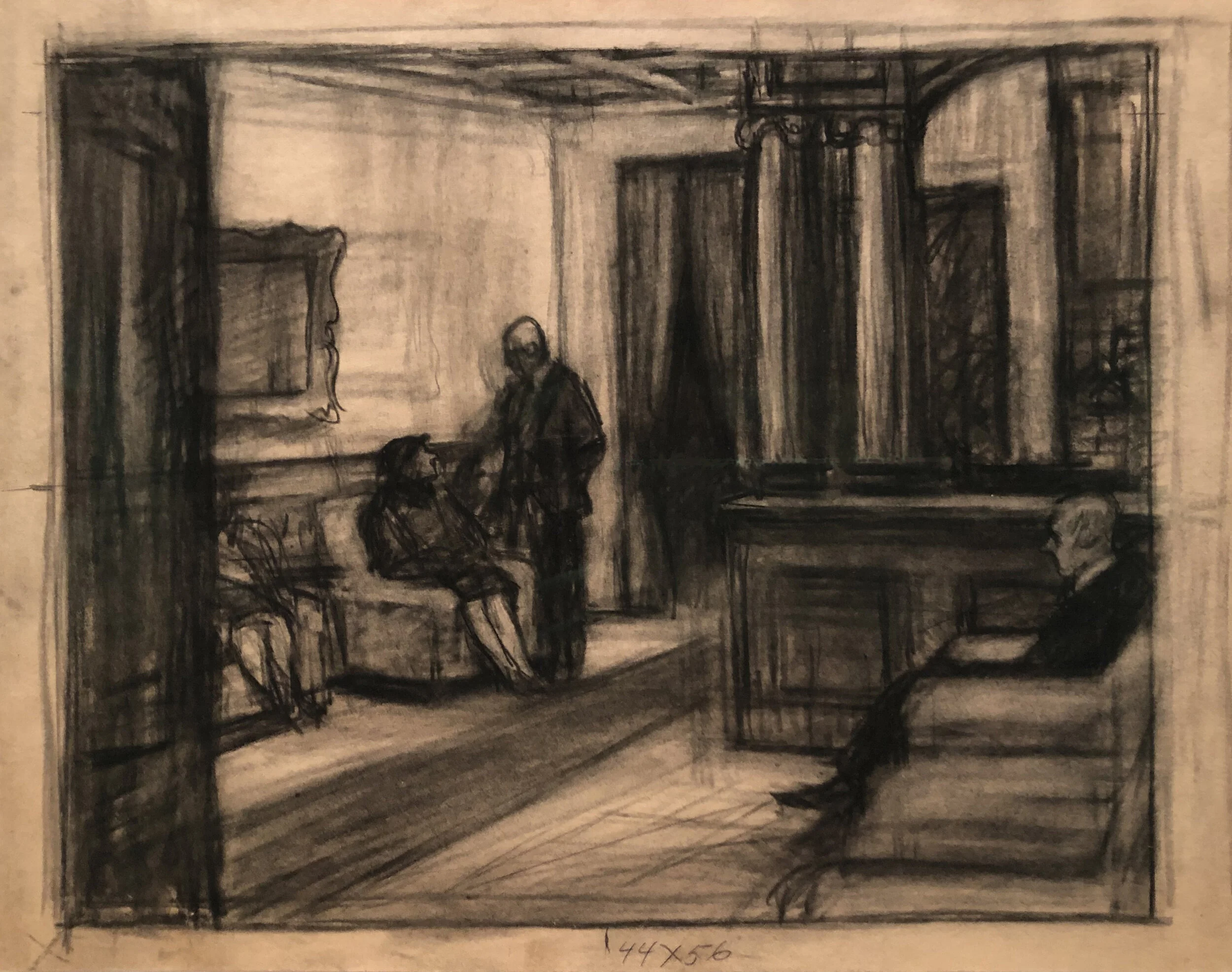
Room in New York, 1932 gives us a snapshot, a voyeuristic view of a couple through a window, the man absorbed by his own reading, the woman turning away, distractedly stroking the key of a piano. We seem to be momentarily glimpsing strangers in a random, everyday moment, perhaps as we pass along on the road; but every element, every angle, color and shape is calculated to bring our attention to the psychological space between these figures in a silent, mundane drama.
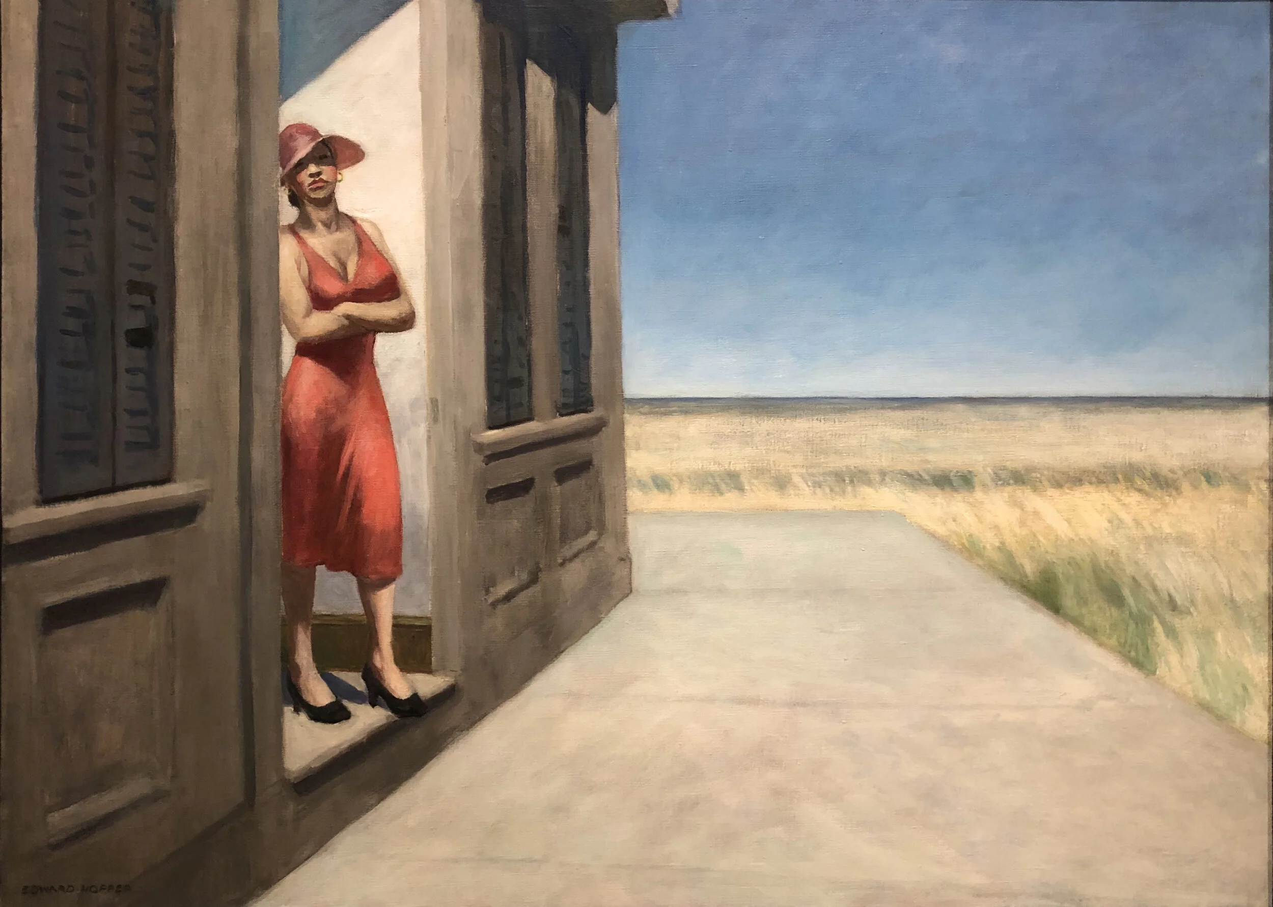
In South Carolina Morning, Hopper gives us a spare walkway, a blond, open field straight ahead and to our right, and a woman in a doorway on our left. The open space we anticipate on that side is to denied us by the block-like building – and so a void, an empty space, exists there mentally. Such odd denials of space played an important role in his work for decades: windows we can barely see out of, areas blocked by weighty slabs of brownstone or concrete. The paradox of weighty physical voids. Not only are there strange voids and mysteries in the spaces of these pictures, but there is often a kind of weighty psychological void conveyed via the illusion of the spacial ones.
Hopper was keen to point out that he was interested in real visual things, light on a white wall, architecture, certain expressions and gestures: “My aim in painting has always been the most exact transcription possible of my most intimate impressions of nature.”
But he was also very adamant that the outward form was not all there was. The inner life of the artist, the inner life of the viewer, and how painted forms conveyed that inner life, were all of tantamount importance: “Great art is the outward expression of an inner life in the artist, and this inner life will result in his personal vision of the world…the inner life of a human being is a vast and varied realm.”
Between these two things Hopper experienced another kind of gap, a tension in his painting process resulting from the sheer difficulty of reconciling the interior life and its external manifestation on the canvas: “I find, in working, always the disturbing intrusion of my elements not part of my most interested vision, and the inevitable obliteration and replacement of this vision by the work itself as it proceeds.” In other words, the vision was always in danger of being overrun by the reification of the visible form.
Thus we begin to account for the modern nature of Hopper: the architectonic structuring, his concern for the inner life, a tense rather than easy mastery of form, and finally, all this wrapped up in his own peculiar kind of visual existentialism. Hopper’s use of the Hotel makes perfect sense as a motif, for the Hotel, and even the American highway system itself, is a kind of no-man’s land, something solid but impermanent in our experience of always passing though. Solid voids. Such roads and road-stops, despite their high use, are often isolated and solitary, characterized by a vague sense of alienation. Anyone who has driven across the country on a budget knows there are innumerable Hopper-like, in-between places filling the continent, all the way from Wells, Nevada to Waverly, New York.
This is a show totally worth seeing. And yet, there are some very confusing things going on, curation-wise. It is as though the topic of the hotel, once decided upon, became the random criteria by which all kinds objects were chosen to be exhibited. Hopper’s work is heaped in, like so much hotel art, as though he were an illustrator with no higher intent beyond doing paintings on “the hospitality service subject.” Period post cards are displayed willy-nilly, some in large groupings, others by themselves. A random slew of artists have been injected into the space, ostensibly because they provide a piece or two with some connection to hotels: from John Sloan and Stuart Davis, to George Sengal and Cindy Sherman. It is as though they have each been made subservient to the all-important Hotel Topic. There is very little art historical analysis, no formal analysis, and very little comparison between Hopper and any of the other artists. The lay out of the show is utterly confusing. We get lost in the morass. The spirit and intent of Hopper’s work is shouted over.
As if to make up for that, we have been provided with a couple of gimmicks. Innocent gimmicks, but more distractions nevertheless. Two “Hopper Hotels” have been installed into the exhibition rooms, replete with chairs, retro colored carpets and even a bed you can sleep in (or so I am told.)
To liberally paraphrase Rothko; this is a very strange exhibit, but it is not whole as Hopper is whole. It is fractured, a Postmodern pastiche in an era of random internet searches and three-second attention spans. Such an arrangement breaks much of the spell of Hopper’s work. This seems intentional. The anecdote and the distraction all feel highly calculated. All jazzed up to divert our attention. Are we really so afraid of facing Hopper directly, on his own quiet terms?
I hope not. And I’m confident that people still love his art. They don’t need the gimmicks to get them in the door. There are other ways.
Go see this show. It has a lot to offer, and despite the distractions and outright shenanigans, a lot of great work is on display. There are deep mysteries in the painting of Hopper. There always will be. Go see it in person, and don’t let that mystery be overwhelmed by the noise.
Miles Hall is a painter and art educator. He has taught Drawing, Painting, Color Theory, and Modern Art History at Virginia Commonwealth University and Virginia State University. He has an MFA in Studio Art and an MA in Modern and Contemporary Art History Theory and Criticism.
